top of page
Flora Bay Arts Camp
Flora Bay Arts Camp is a Waldorf-inspired children’s camp rooted in nature-based education. Nestled in the redwood groves and parks of San Francisco, the camp nurtures creativity, environmental awareness, and hands-on exploration through seasonal craft-making and play.
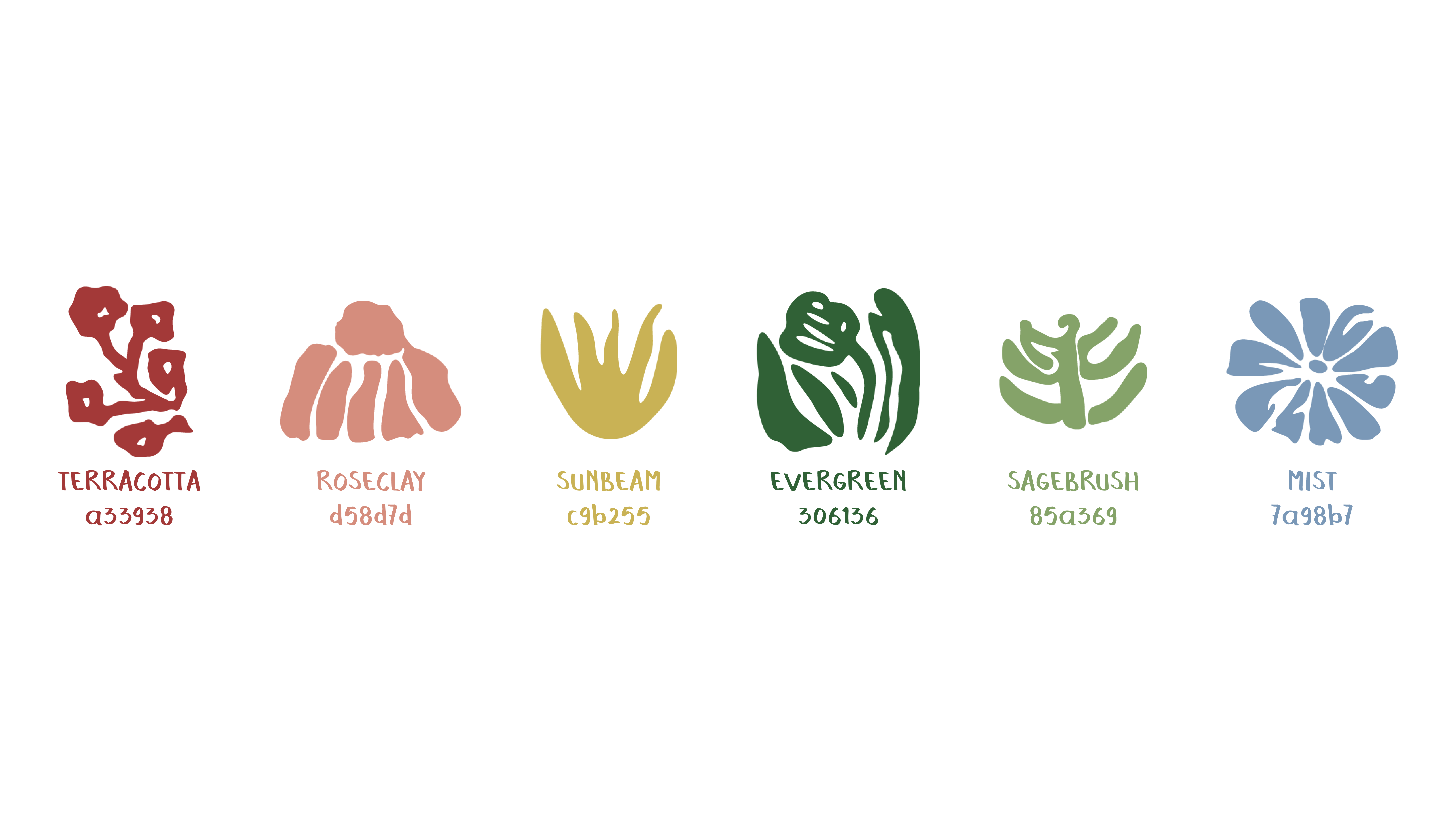
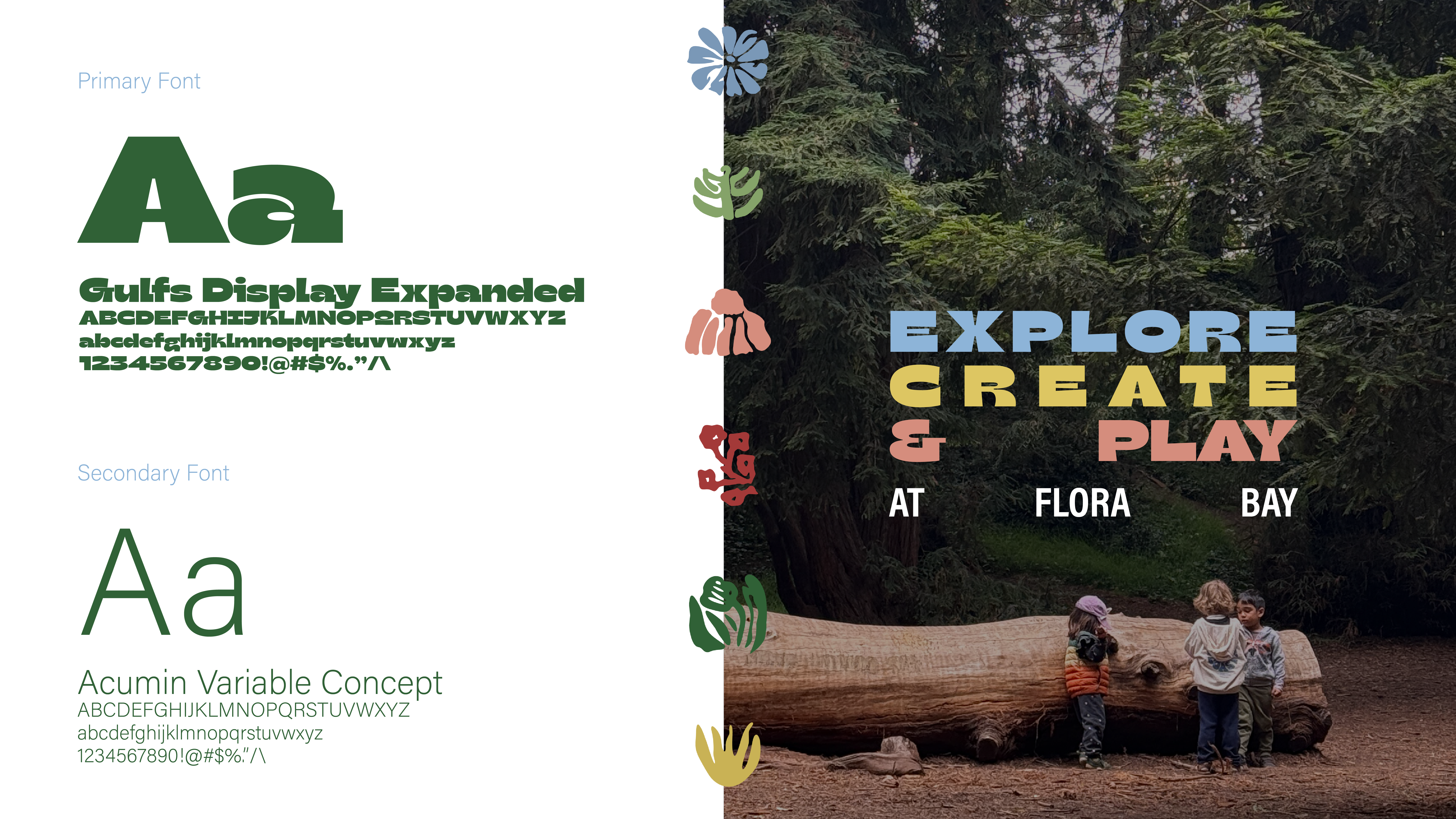
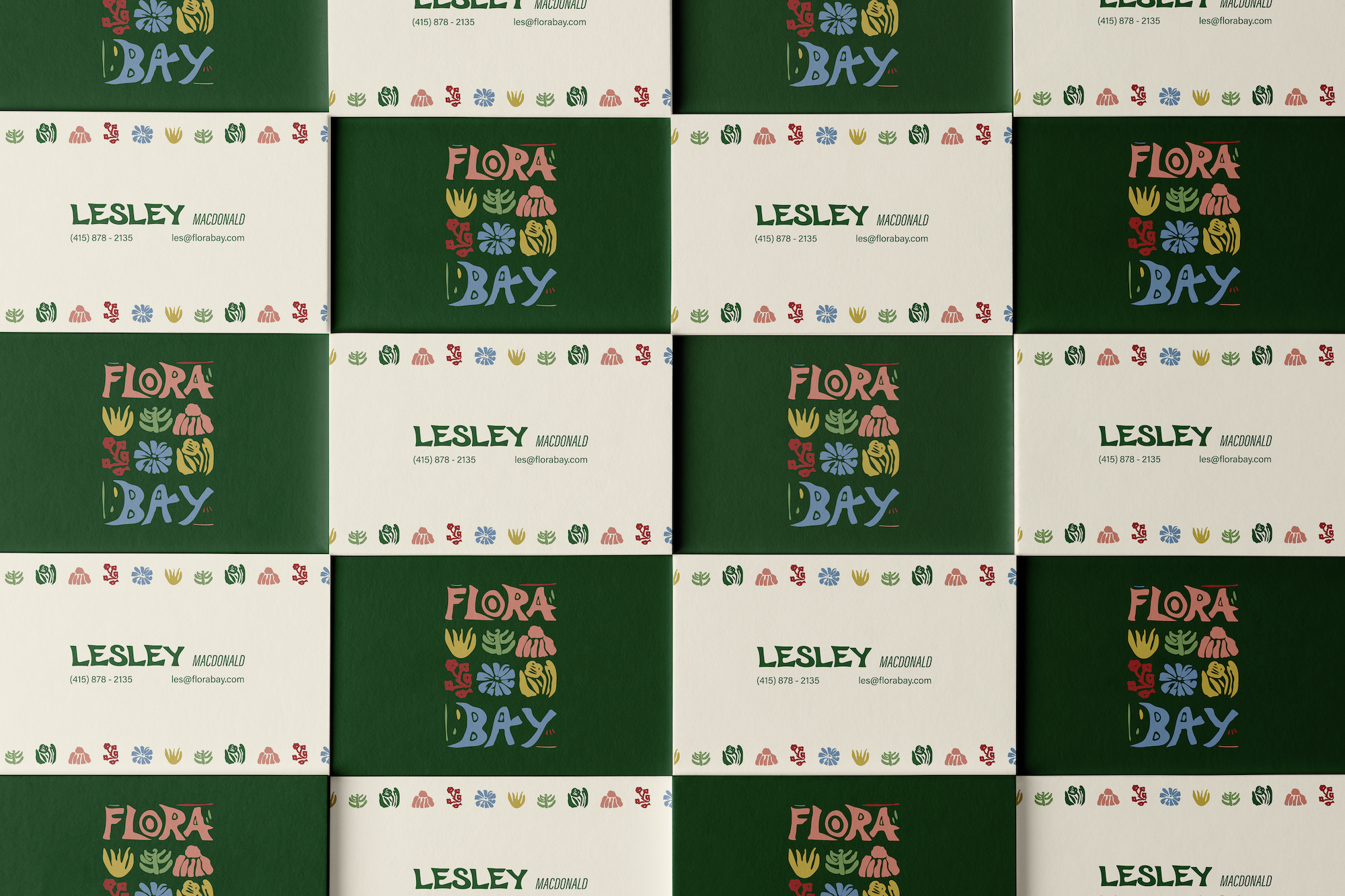
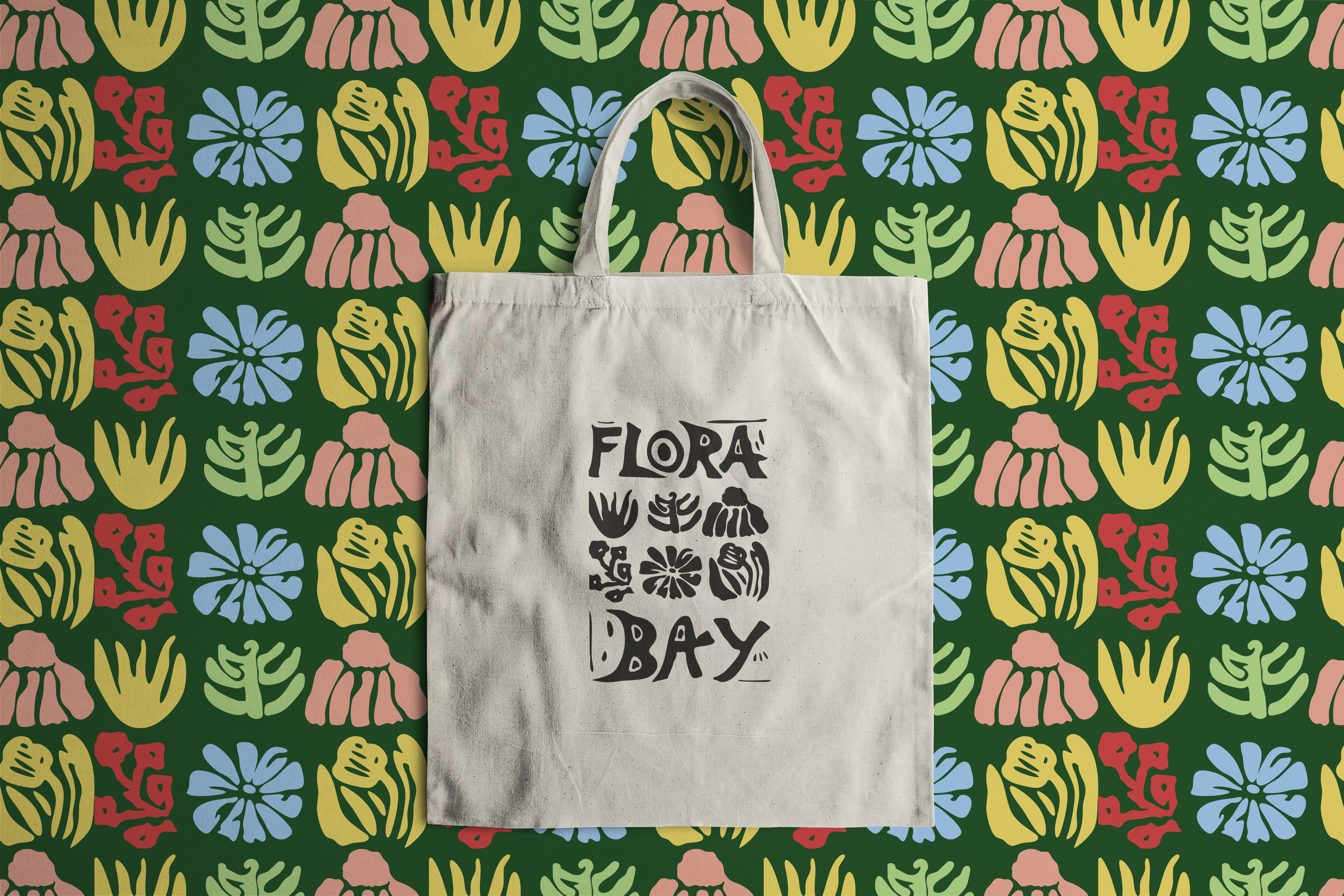
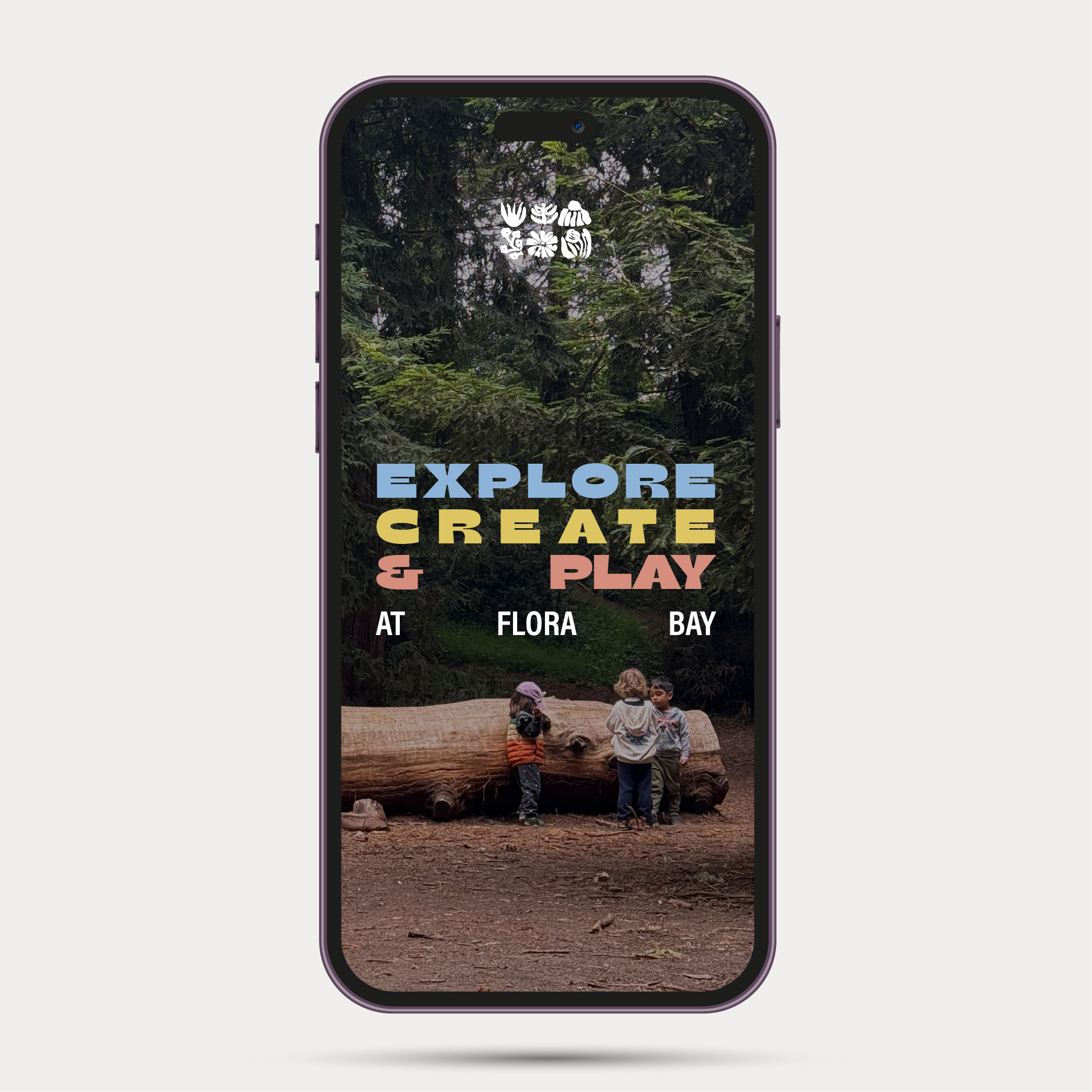
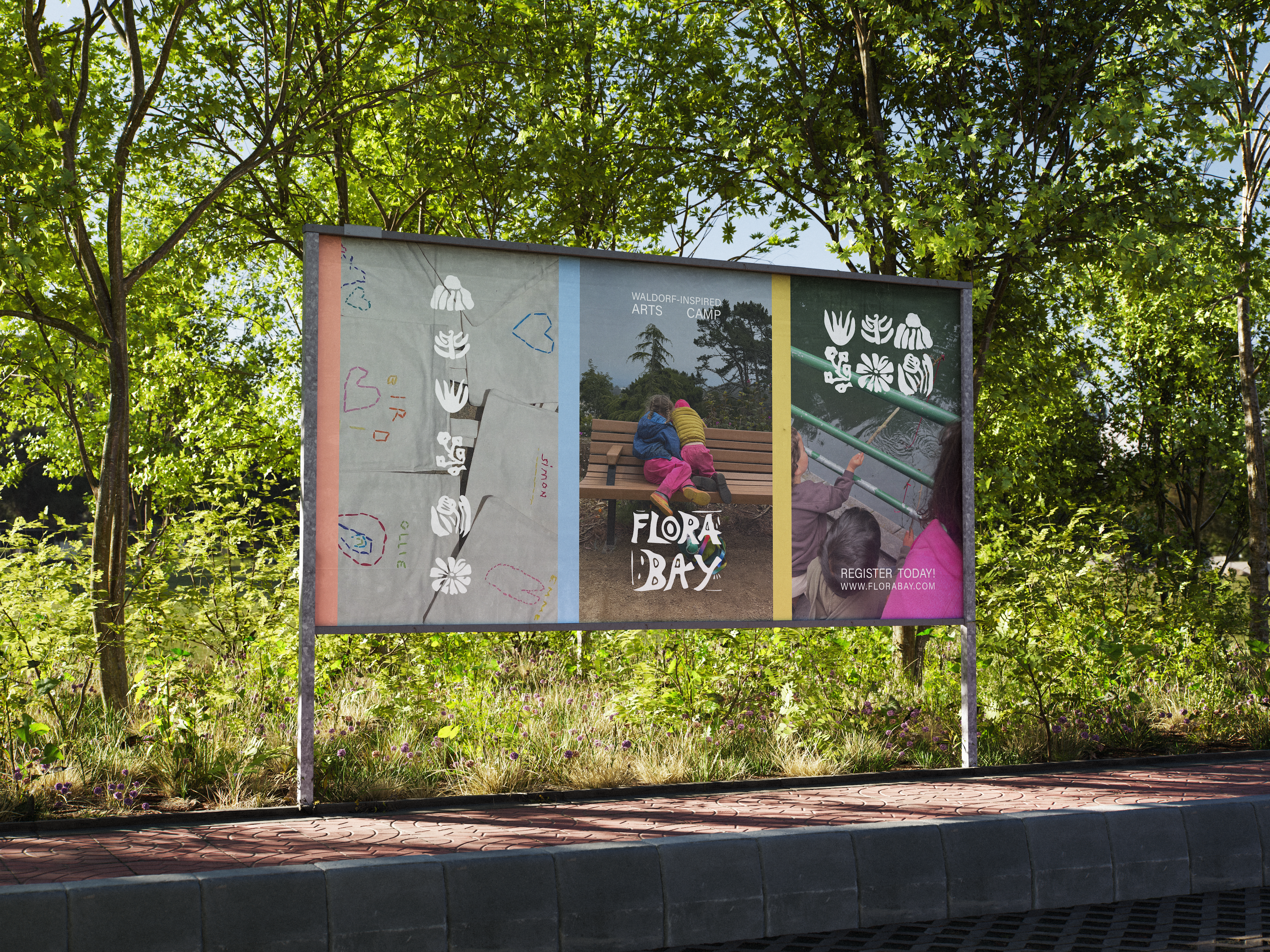
I led the brand development of this project. This included logo design, typography, color palette, and print collateral. The visual identity system was designed to reflect the camp’s whimsical, earthy tone while remaining scalable across digital, print, and merchandise applications. The result is a cohesive brand that captures the magic of childhood curiosity and the spirit of outdoor, craft-centered learning.
Project type
Branding
Programs
Adobe Photoshop
Adobe Illustrator
Adobe Premiere
Procreate
01
Flora Bay Arts Camp

01
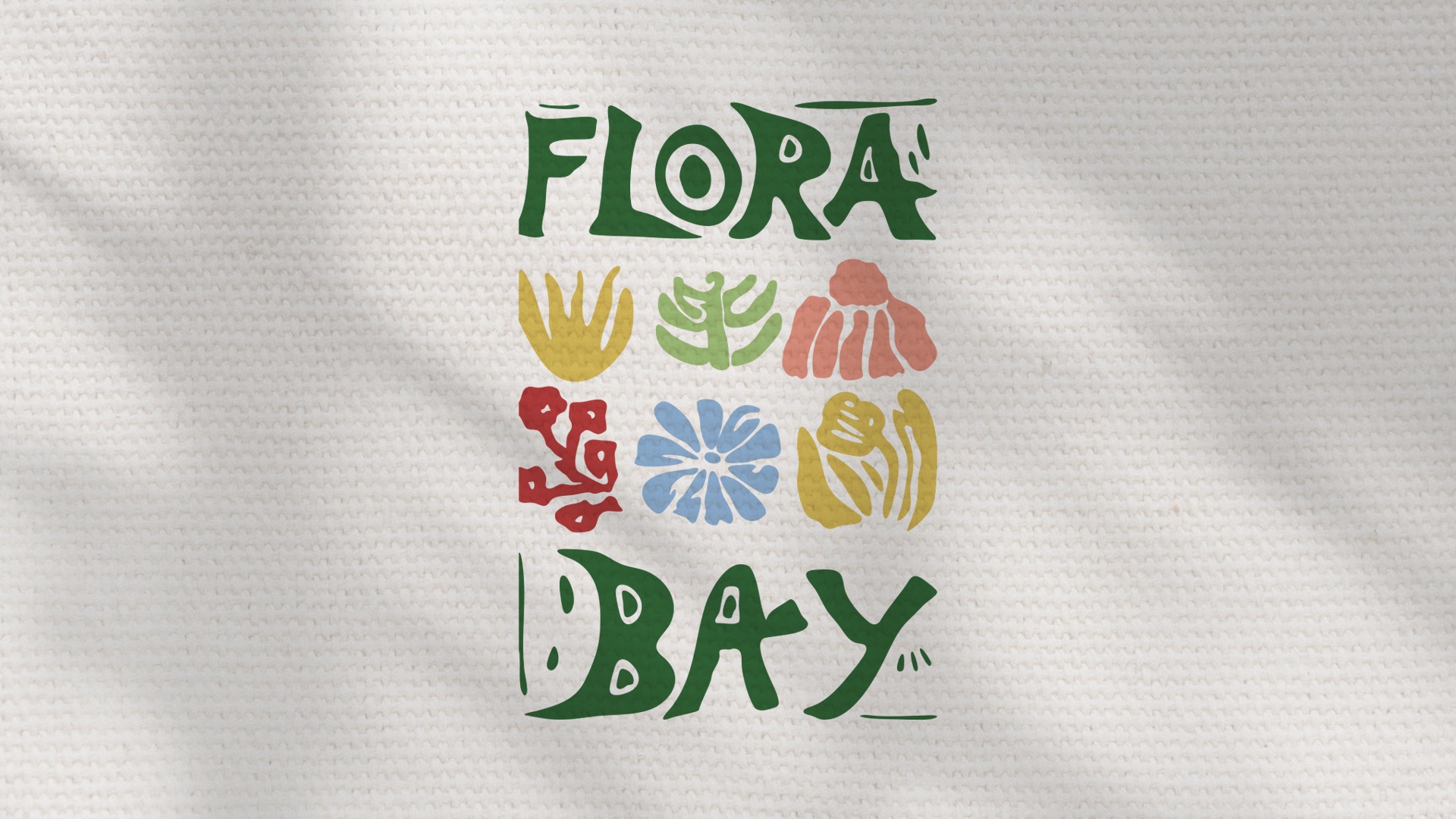
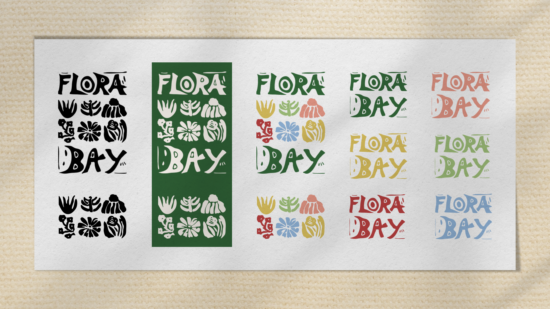
The Flora Bay logo suite began as a hand-carved block print, reflecting the camp's hands-on, creative philosophy. At the heart of Flora Bay's mission is the idea of making, exploring, and creating with the materials around you, so it felt only natural for the brand itself to be crafted entirely by hand.

02

03

04

05

06

07

08
bottom of page